When creating the wireframe for my app, i organised 3 sections, those being the ‘Main Game’ ‘DLC 1’ and ‘DLC 2’ into individual boxes. Instead of designing my companion app for a game series, I chose to design it for a game and 2 DLCs, as the game was going to be large, and I didn’t want to over-scope. The 3 boxes are connected to a ‘Main Menu Screen’. I also used 2 stickers to keep track of completed and uncompleted work.
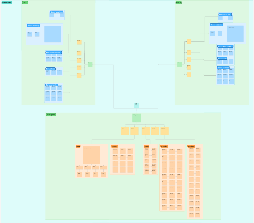
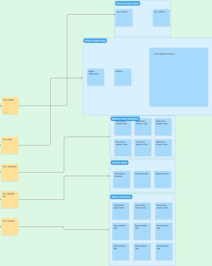
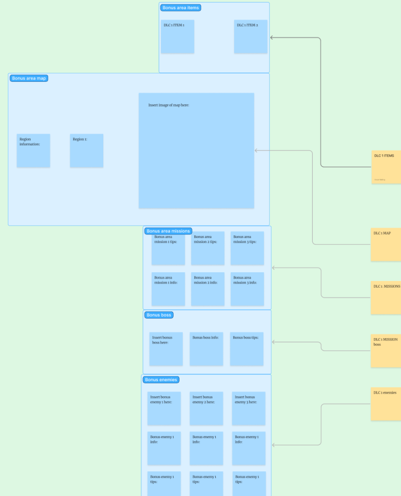
When creating layouts for both DLCs I decided to make them a similar layout to the ‘Main Game’. This is because the DLCs would add a little more of everything the main game features (Enemies, missions, items, etc.) Because of this, changing the layout from how it is in the main game would make the app inconsistent and harder for the user to navigate.
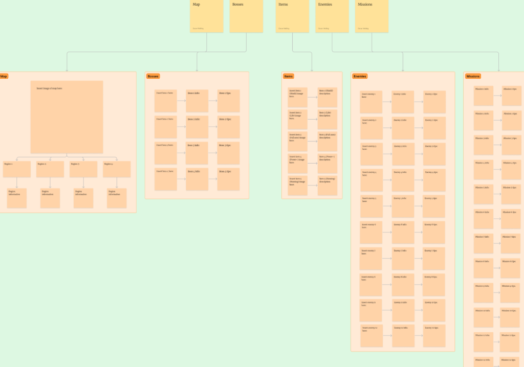
For the main game section, I added smaller boxes for each screen the user will be able to navigate to. So that all of the information in the app is spread out across different screens. For example there is an enemies screen, a boss screen, and a missions screen to name a few. I designed the layout this way to make it more accessible and easier to navigate for the user, as if all of the game’s information was only on 1 or 2 screens, they may have needed to scroll a lot to find the information they want.
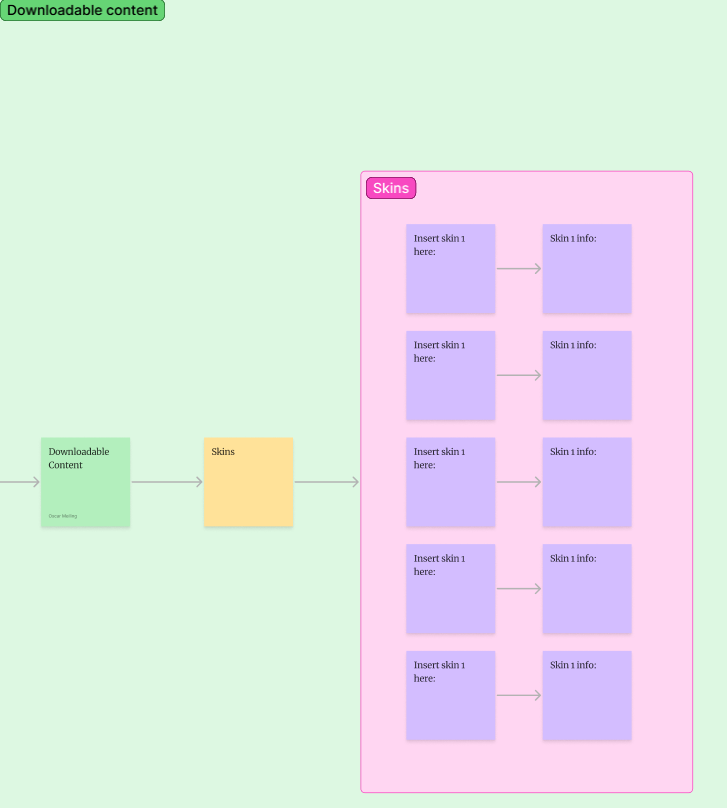
Initially, I was only going to have 1 of the DLCs be an expansion to every aspect of the main game, and the 2nd DLC was going to have a skin pack for the player model. However I decided against this because I felt like including this information in a companion app didn’t have much of a purpose. So I decided to make both DLCs be equal in content, and I removed the idea of using player skins completely.