To create my companion app, I used Figma to create a high fidelity prototype. For the most part I followed the wireframe that I created in FigJam, but I made a couple of minor changes, namely reducing the amount of individual buttons and screens, allowing for an improved user experience as navigating the app would be made quicker and easier.
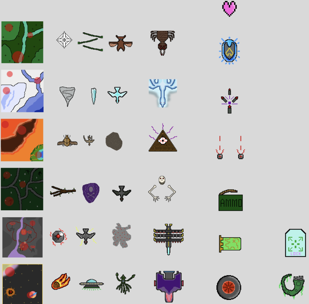
I decided to use simple and understandable icons for my buttons. Using a map for the maps screen, a checklist for the missions screen, etc. I created simple icons for buttons in Photoshop, maintaining the artistic style I used for the game assets (shown below). I came across a slight issue however, as unlike with the back and home buttons which i made a light and dark variant of, when I hovered over the buttons at the top of the screen, I had no way to make the icon darker, making it harder for the user to know if they pressed the button or not. To fix this I moved the top of the grey box containing the game info down a bit. By doing this, it not only improved the design of the app by giving it an understandable and segmented look, but it allowed me to reduce the opacity of the buttons, which gave them the effect of being darkened while being hovered over due to the black background.

Since I had a lot of information, it didn’t all fit on the screen at once. To fix this I experimented with multiple solutions. Firstly, on the map screen, I hid the text behind buttons. While this didn’t stop the text from overflowing, it helped make the screen look less cramped and full of information. My primary solution was to use a scroll function. I did this by removing clip content from the text and resizing the text box to the bottom of the grey panel making the text only appear until the bottom of the panel.